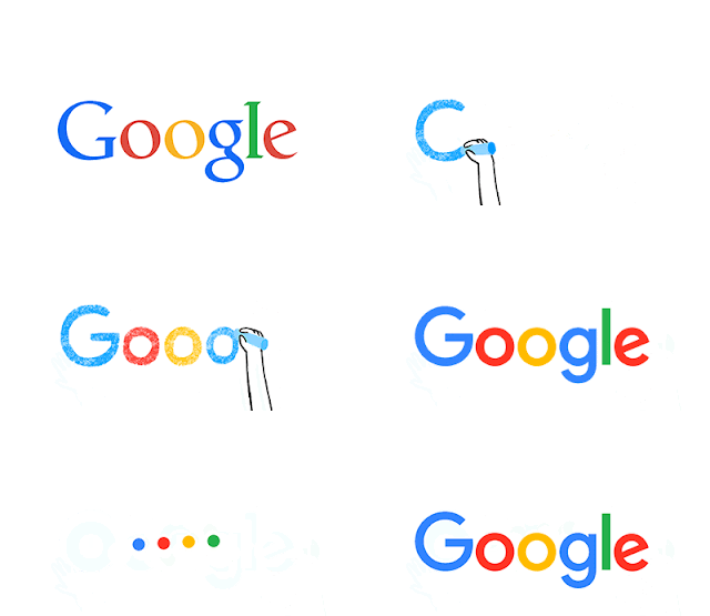
Google redesigns It's logo
Google is giving itself a makeover today. The company today announced that it’s making some changes to its iconic logo and overall branding. It’s also making changes to the design of its search results pages. The company says it’s making these changes because the way people interact with its products has changed. The idea if for the new logo and identity family to reflect “this reality and shows you when the Google magic is working for you, even on the tiniest screens.”
The old Google colors are still there, but Google has moved from a serif font to a sans-serif fonts for its full logo. For its icon, Google has done away with the small blue ‘g’ icon and has replaced it will a four-color “G.” Inside_Search“We think we’ve taken the best of Google (simple, uncluttered, colorful, friendly), and recast it not just for the Google of today, but for the Google of the future,” the company writes in today’s announcement.
As Google's video introducing the new logo notes, the wordmark has been evolving ever since it was created in 1998. But this is easily its biggest change since 1999, when Google first cleaned up the lettering and settled on its four colors. Since then, the logo has just been flattened out more and more, with today's update representing a huge leap.
Given the fact that Google is now part of Alphabet, it’s probably not a major surprise that the company is using this time of change to refresh its brand, too.
The old Google colors are still there, but Google has moved from a serif font to a sans-serif fonts for its full logo. For its icon, Google has done away with the small blue ‘g’ icon and has replaced it will a four-color “G.” Inside_Search“We think we’ve taken the best of Google (simple, uncluttered, colorful, friendly), and recast it not just for the Google of today, but for the Google of the future,” the company writes in today’s announcement.
 |
| New Logo And Icon |
Given the fact that Google is now part of Alphabet, it’s probably not a major surprise that the company is using this time of change to refresh its brand, too.
Spark It Up
Google redesigns It's logo .See the New one
4/
5
Oleh
Unknown


![[Tutorial] How to Add Lightweight Breaking News Widget in Blogger . With Code . [Tutorial] How to Add Lightweight Breaking News Widget in Blogger . With Code .](https://1.bp.blogspot.com/-u52R_AlqNT0/Vwd8rhxSCsI/AAAAAAAADzQ/UsPwNZhEBwYfP1ddtE8K7emOEf1naBNgA/s72-c/Cara%2BMemasang%2BWidget%2BBreaking%2BNews%2Bdi%2BBlog.png)
thanks for commenting !!!